An app helping homeowners ditch fossil fuels
Gridly / Home Energy Improvement App
Gridly is web app that helps homeowners in New England breakup with fossil fuels. Folks enter their address, answer a few questions, and receive a “Action Plan" for their homze. The Action Plan is a series of projects designed to reduce the home's carbon footprint. And projects in the plan vary in scope from appliance replacement to complete solar transition.
Gridly has an unique brand perspective and market fit. Lot's of companies are offering solutions for each category, but no one is pulling them all together. The idea presented a big design challenge: how do we combine disparate experiences into a unified flow? And how do we avoid overwhelming the user? To select projects for the Action Plan, Gridly needs a lot of information. Our goal was to leverage oodles of property data and prevent folks from answering lots of technical questions. Visitors need to only confirm information, which gets them to project recommendations faster.
Project Type / Agency
Responsive Web App / The Gnar Company
Role
I helped sell the project, led discovery workshops and user interviews, collaborated with a Product Manager and the engineering team at The Gnar, collaborated with a marketing agency and copywriter, designed the app, and worked directly with Gridly founders.
Design Activities
- User Journey Mapping
- Digital Strategy
- Wireframes Prototyping
- Visual Design
- Design System
- UX Copywriting
Questions & Challenges
With alllll the data and user inputs, how do we avoid overwhelming folks with information, and how do we create a robust visual hierarchy that makes things easy to find?
Most folks want to do right by the environment, but saving money moves the needle. What value angles/messages appeal to people the most? And how can we reinforce that value with saving sweet Mother Earth?
When it comes to home improvement, how do we educate the uneducated while not creating a speed bump for the experienced?
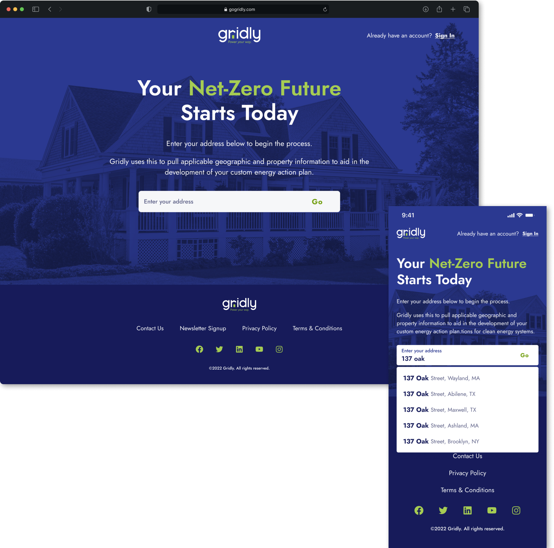
We made the app faster to use by pulling home data.
The landing page of the application was simple by design, and the aim was to grab folks attention immediately, reinforce the messaging that got them there, and ask the question that drives a lot of the backend: “what's your address?”.
Address entry is fast through the validation and type-assist work of the Google Maps API. Ideally, folks would only have to enter a couple of keystrokes to find their home.
The mantra of the entire product team: “the least amount of user entry, the better.”
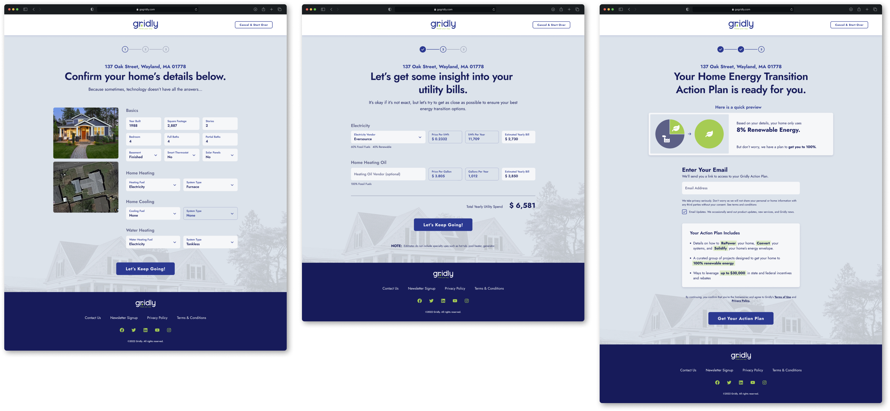
We organized and chunked information to make onboarding faster.
In order for a visitor to see their custom Action Plan, they must provide a bit more home information. We designed a series of three screens with a logical, linear flow. Behind the scenes, data sources provide most of the answers. Visitors don't have to type everything line by line; they just review and confirm the info's right.
Because we knew email entry would be a roadblock for some folks, we designed content areas to specifically test savings and incentive messages to keep visitors moving forward.
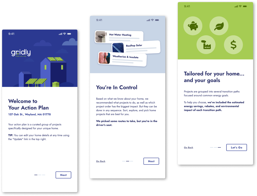
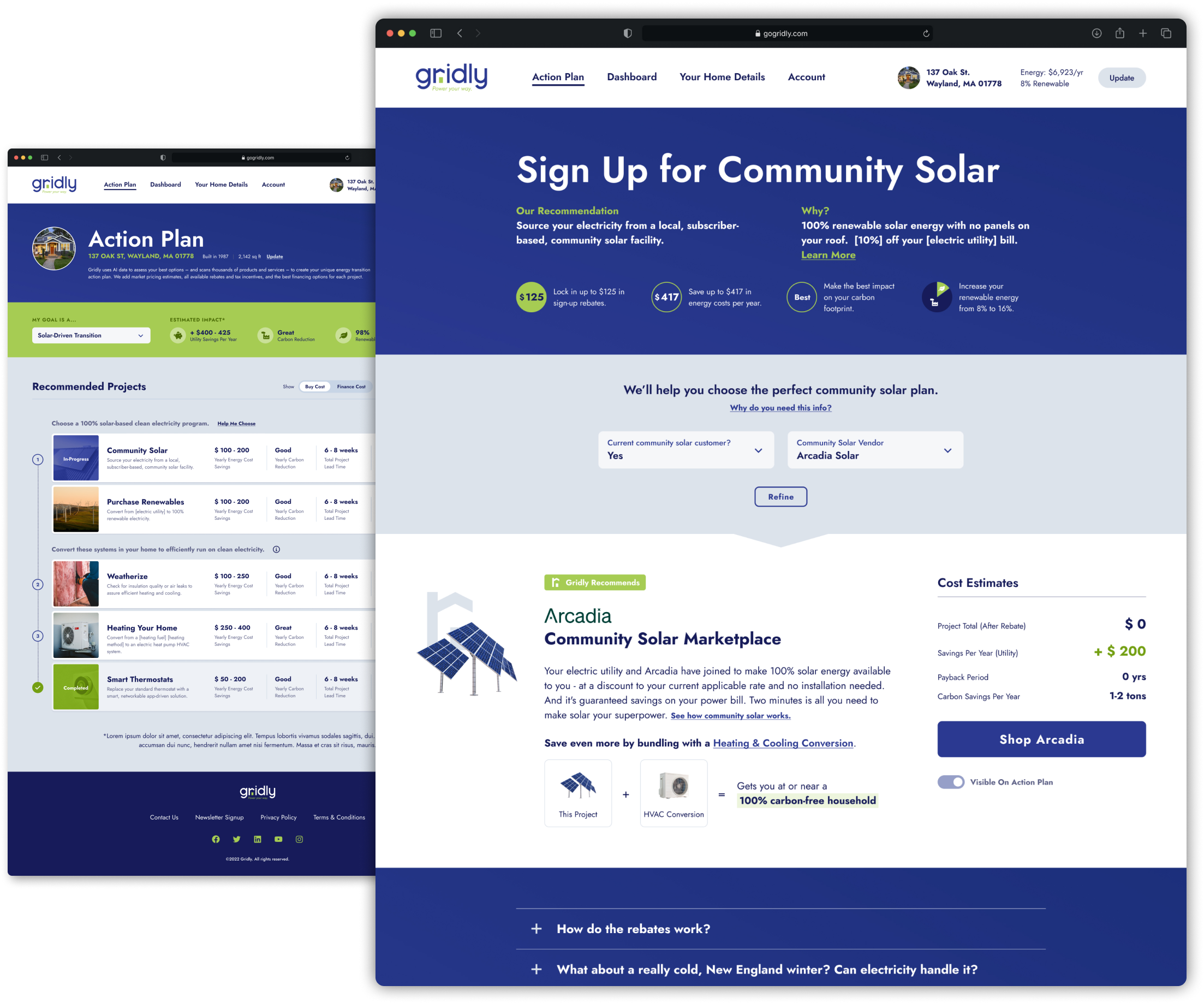
We got wicked good feedback from home owners, kid.
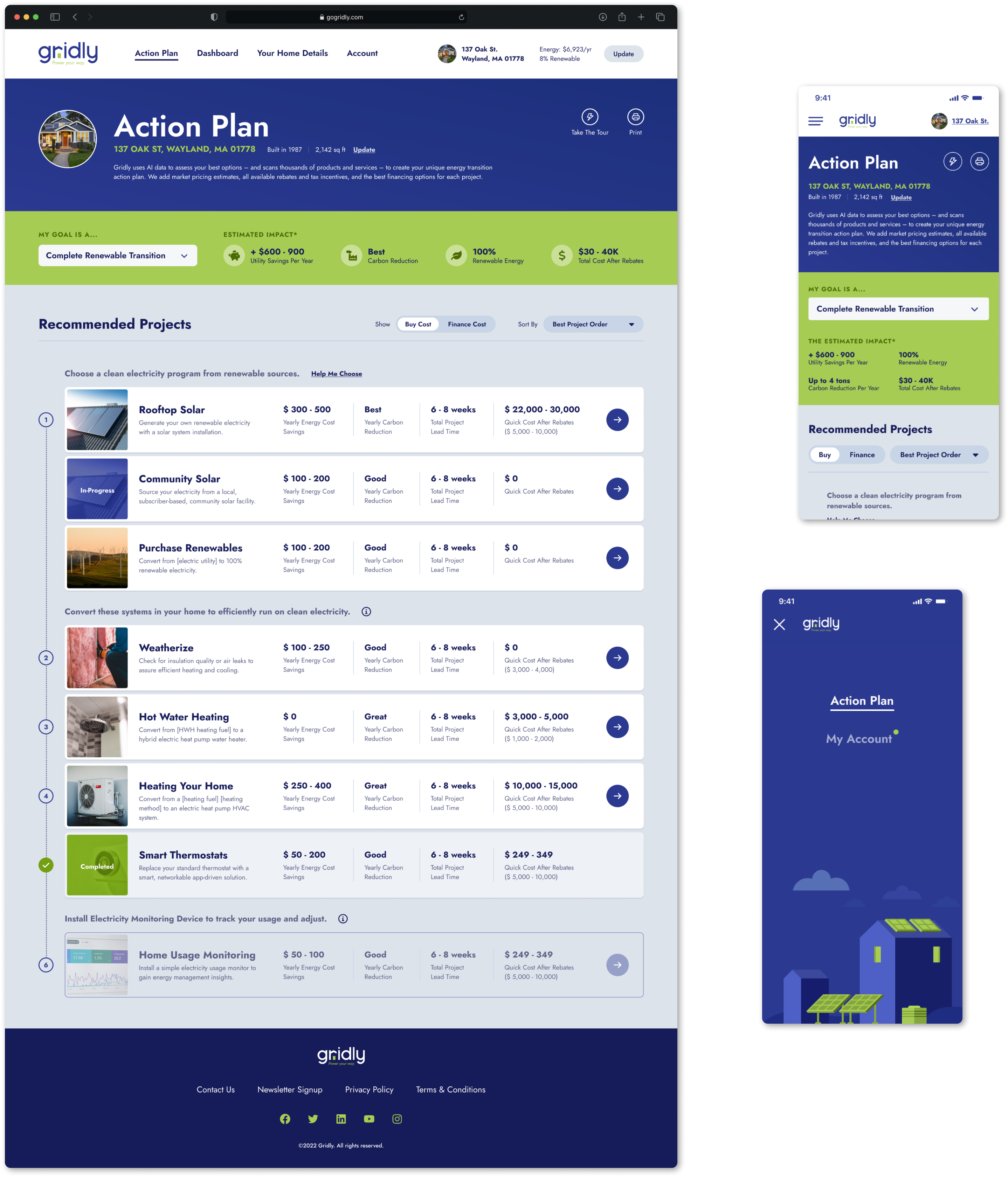
In the Action Plan, there are lots of home projects aimed at achieving 100% renewable home energy. Projects vary from large to small, and each have their own Detail Pages. The PDPs explain in plain talk the benefits and savings, as well as the home owner's investment.
Most of the projects are crazy complex. So we sliced up the benefit/savings content and the additional user-entry questions. And used Progressive Disclosure methods to feed visitors small, quick bites. (Here comes the airplane!)
We validated hierarchy and savings content with a small group of home owners in Boston. Frequent feedback helped us strike a good balance between education, information-gathering, and sales pitch.
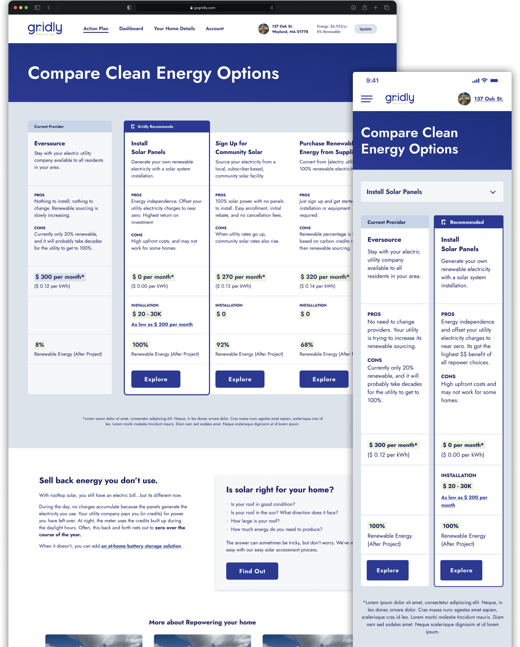
We created shopping tools to simplify big decisions.
We designed a way to compare similar projects that's fast to use and easy to skim. One of Gridly's value propositions is acting kind of like an energy sherpa. (Someone who's done it all and is here to help you get to the peak.) We spent lots of time validating project summaries and ordering of benefit chunks.
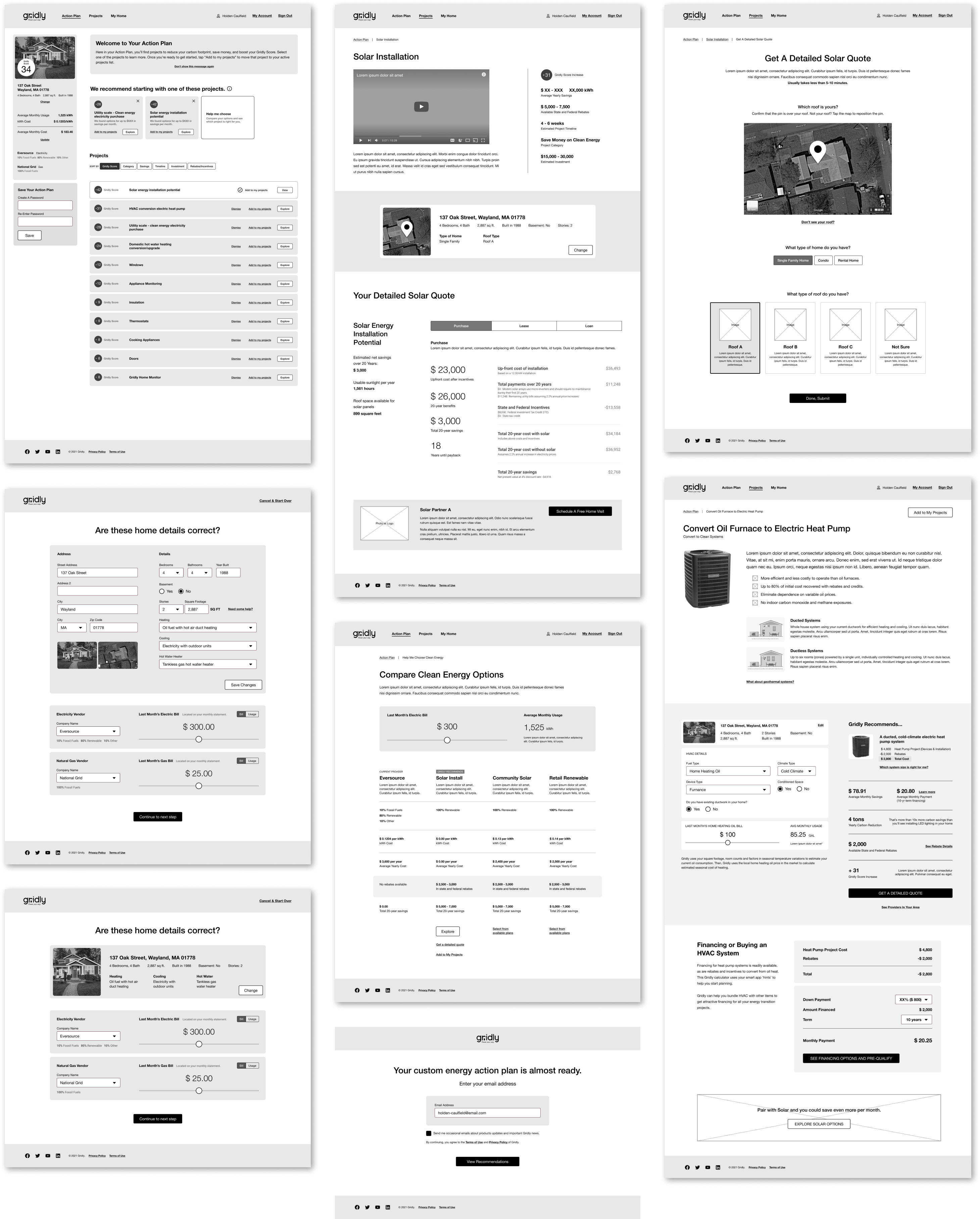
Quick prototypes helped us talk to users and engineers more frequently.
Producing high-fidelity wireframes allowed us to get faster input, which ultimately sped up the overall project and led to a better app. And because much of the experience relied on home data APIs, we worked with the engineering team from the start of the project to understand what's possible.
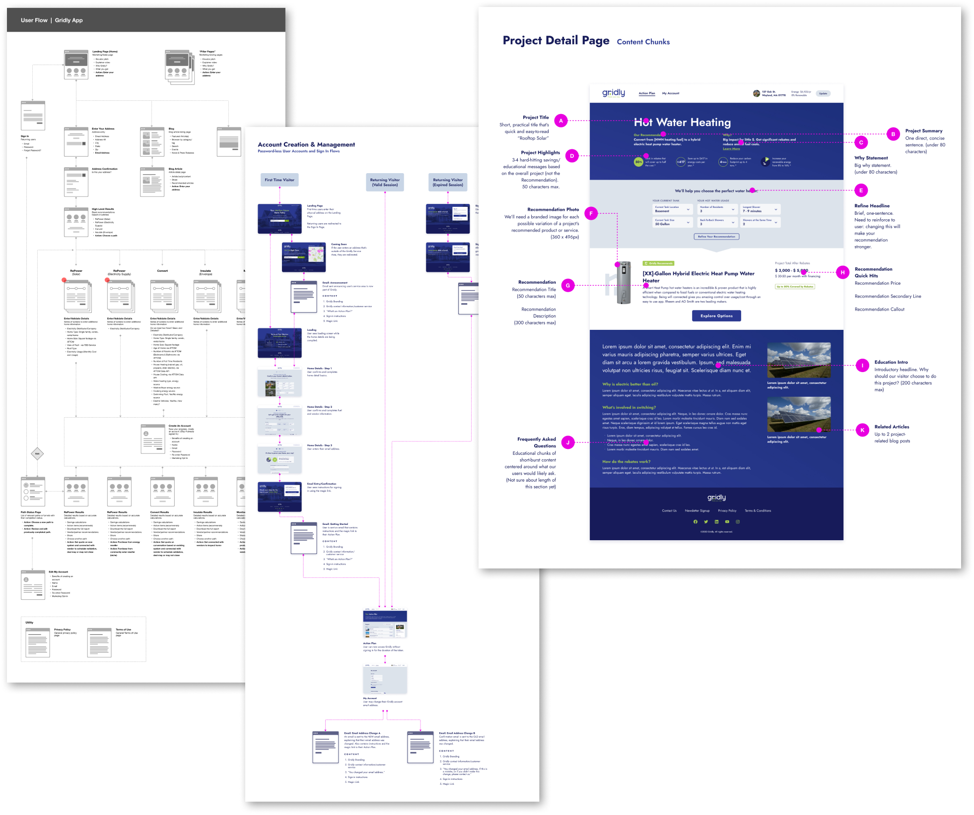
Formalizing and maintaining artifacts kept everyone on the same page.
Throughout the project, we created several user journey flows, diagrams, and documentation. They helped more ideas forward and acted as the single point of truth for Gridly, design, product, engineering, and marketing.

We designed and tuned a custom UI Kit for max speed.
Since a lot of the screens and flows went through many iterations, it was important to maintain an accurate and small library of design components. Limiting the number of one-off styles sped up dev time. And each element was constantly tweaked and re-factored anytime a major section was added or changed.
Let's talk.
Copyright 2023 Joshua Hathaway - Handmade in Austin, Texas - Eleventy, Sass, Nunjucks, HTML, and good ol vanilla Javascript


