A literacy education app helping teachers collaborate
Reading Ways / Teacher Education and collaboration app
Reading Ways is a consultancy that helps schools strengthen their literacy curriculum and create systems for teachers to be successful. They originally began in the Boston-area school systems and have an impressive, science-backed strategy and lots of passion for teaching.
One aspect of their engagements with schools is a companion app, an online application that helps Reading Ways to deliver their Courses to a school's cohort of teachers. Teachers complete exercises, discuss, organize group meetings, dive deeper with more topic resources, and so on. They had something working for now, but Reading Ways was looking for a ground-up user experience that was purposefully tailored to their needs.
Project Type / Agency
Desktop Web Application / The Gnar Company
Role
I helped sell the project, led discovery workshops, collaborated with the Head of Technology and President of Readingways, and designed wireframe prototypes.
Design Activities
- Discovery Workshops
- Information Architecture
- Requirements Gathering
- Wireframes Prototyping
- UI Kit/Design System
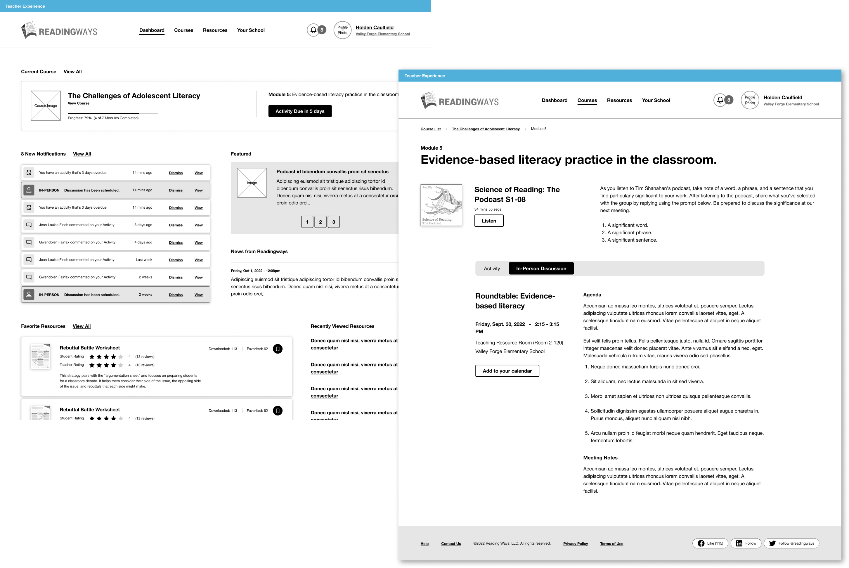
Questions & Challenges
How do we take elements and lessons from an existing online experience and apply them to a new, ground-up user experience? And how we get folks bought in to a much needed overhaul?
Teachers don't have any extra time to do a literacy program!!! (Sorry, I yelled.) How can we make flows, menus - the overall experience - dead simple? Our mantra for the user was: “get in; get out.”
With all the many types of user roles, how do we avoid development cost, streamline functionality, and create re-usable component “chunks.”
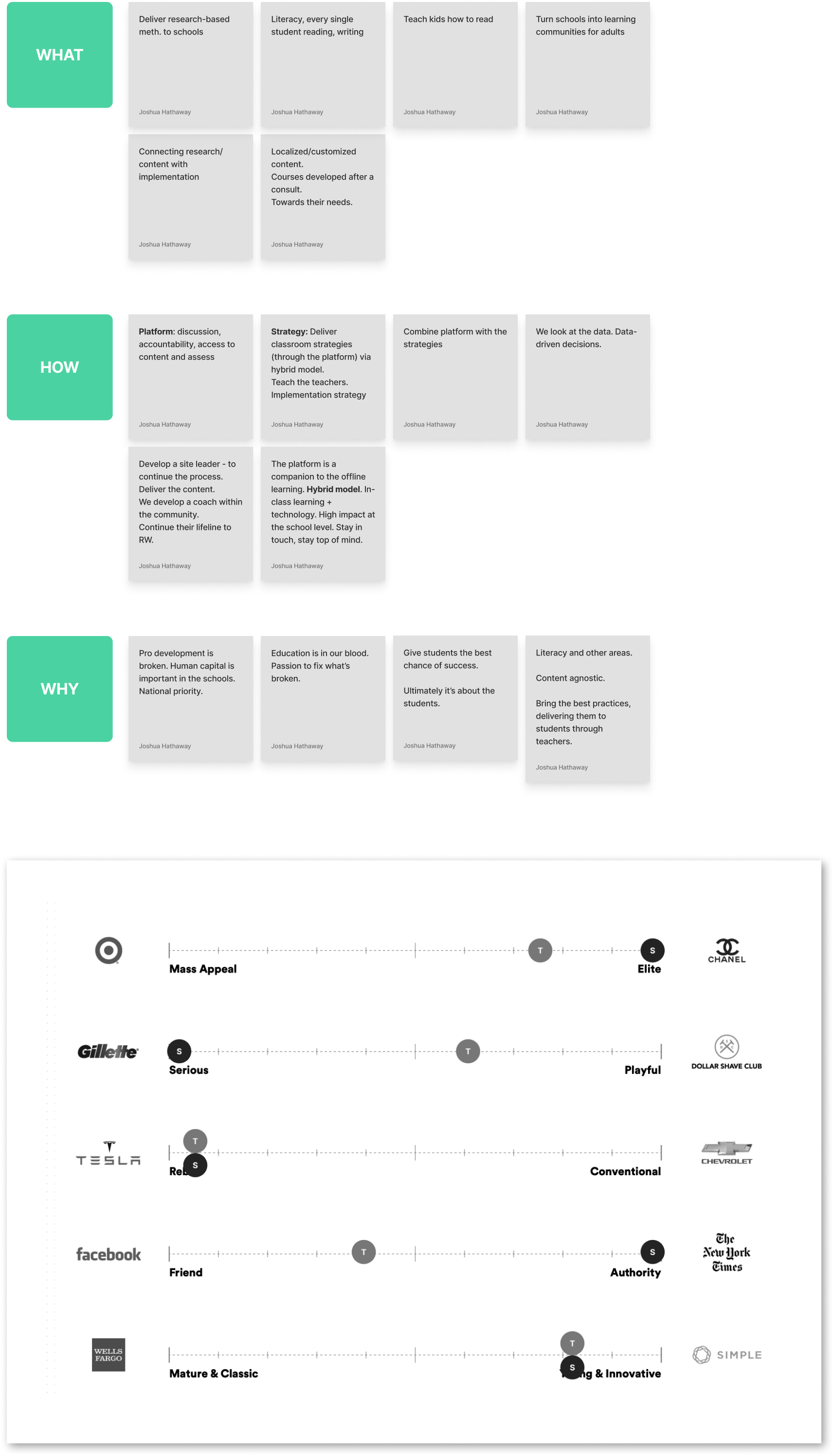
Early workshops unified the product team and steered design.
The early design phase of the project involved our tried-and-true discovery process. On the right are a few of the notes from the initial discovery workshops.
My framework for this portion of the work is based on a handful of activities borrowed and adapted from Google Ventures, IDEO, other agencies, and mentors. All discovery exercises are designed to pull out (and get consensus on) information about the business, the strategy, the users, the goals, the competition, the personality, the team, and measures of success
For Reading Ways, this was hard. They cobbled together a system that was sort of working, so getting consensus on broader-stroke functionality took a lot of time and documentation.
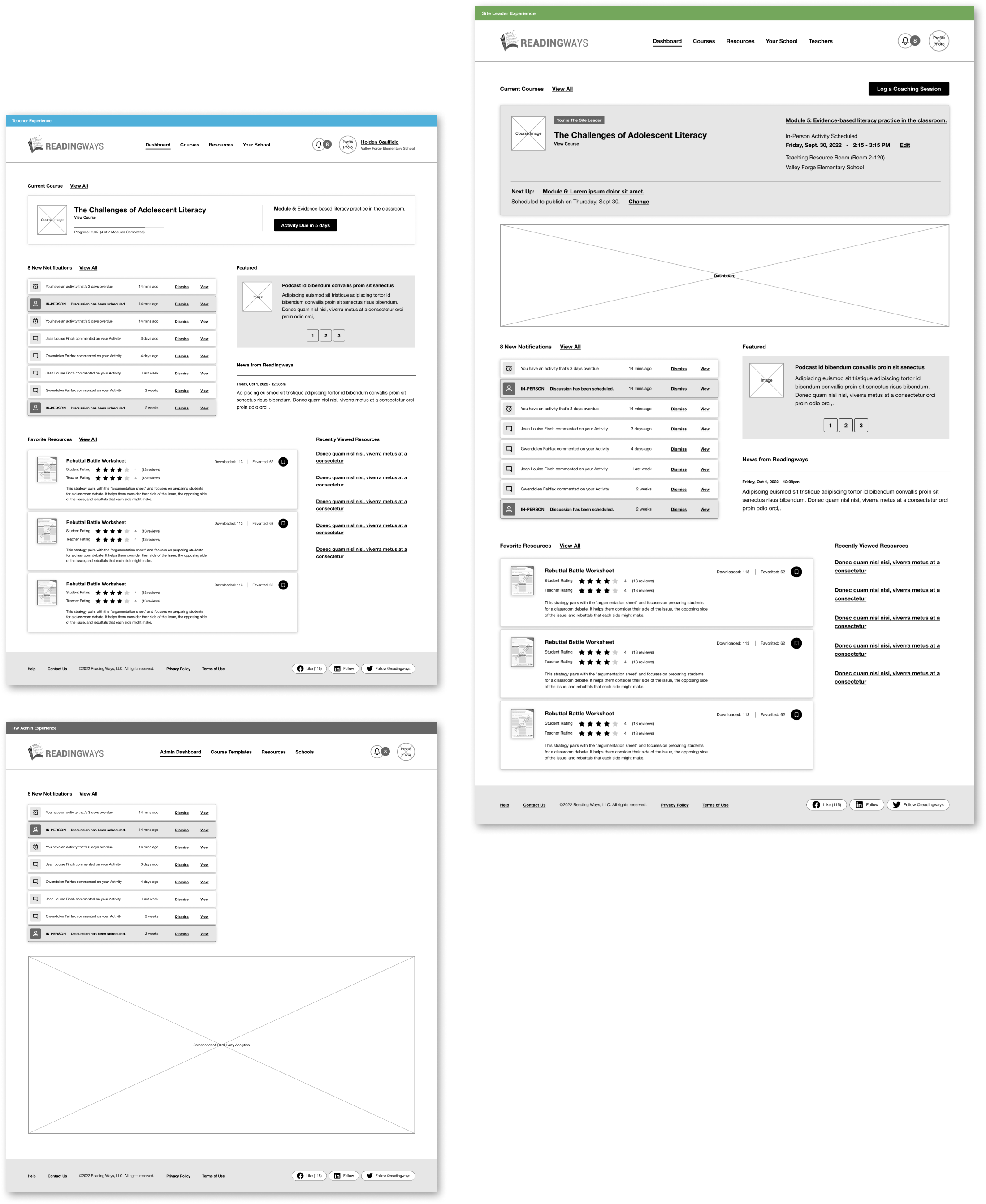
The app was designed around lots of user roles.
Reading Ways' programs involve a small group of teachers led by a head teacher who has been specifically trained to head up the weekly exercises and facilitate discussions. Those lead teachers, or Site Leaders, can do lots of things regular participants can't do, like create and edit courses, manage their school, create and upload resources, and more. In addition to the various levels of teacher roles, Reading Ways also had a couple of different user permissions, with their own specific set of functionality.
Needless to say, it was a Gordian Knot to untangle. We spent lots of time outlining and revising the flows with the project stakeholders and Teacher coordinators, who interact with teachers each day. Not only did we want to simplify the experience in order to save the teacher time, but we wanted to slash down the number of components, buttons, and menus to reduce dev and maintenance. We also wanted the Site Leaders to see exactly what the Teacher sees, and the Admins to see exactly what the others see. This was a massive improvement on the previous platform, because it would allow “user-help” issues to be settled faster.
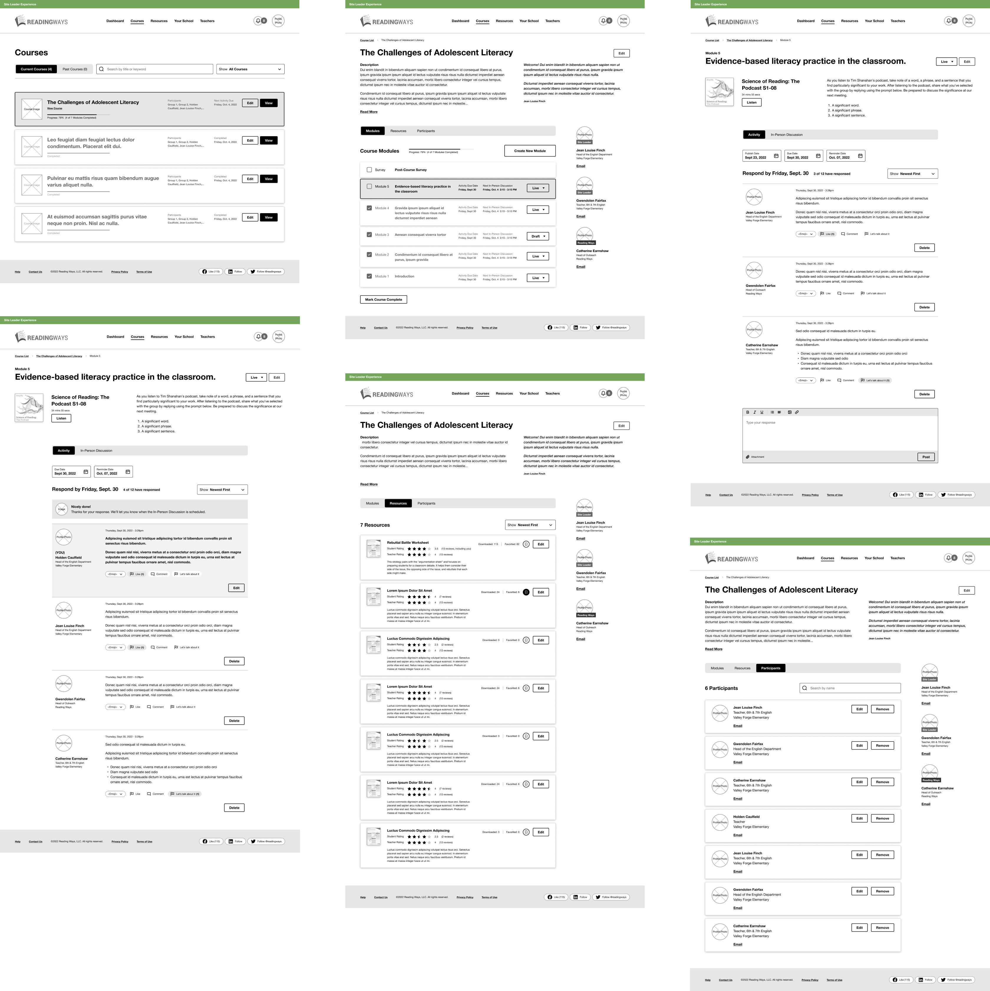
Online exercises boost in-person discussions.
The discovery workshops and brainstorm sessions created a venue for the Reading Ways team to think about the user experience from a broader perspective. Not bound by previous technical constraints, the redesign allowed them to think more “blue sky.” Discussions about User Experience naturally led to new business decisions and changes to their curriculum and offerings. Ultimately, we helped design a brand new structure for Courses that included weekly Modules made up of series of online “Activities” and in-person discussions.
It's within Courses, that Teachers can perform the course activities for the week, respond and interact with other teachers in their cohort, download resources, rate exercises and materials - the ultimate goal: get teachers proactively talking to and learning from each other.
And the school's Site Leader is there to keep things going. Those teachers can create new modules, exercises, organize in-person meetings, create new materials, and a ton more.
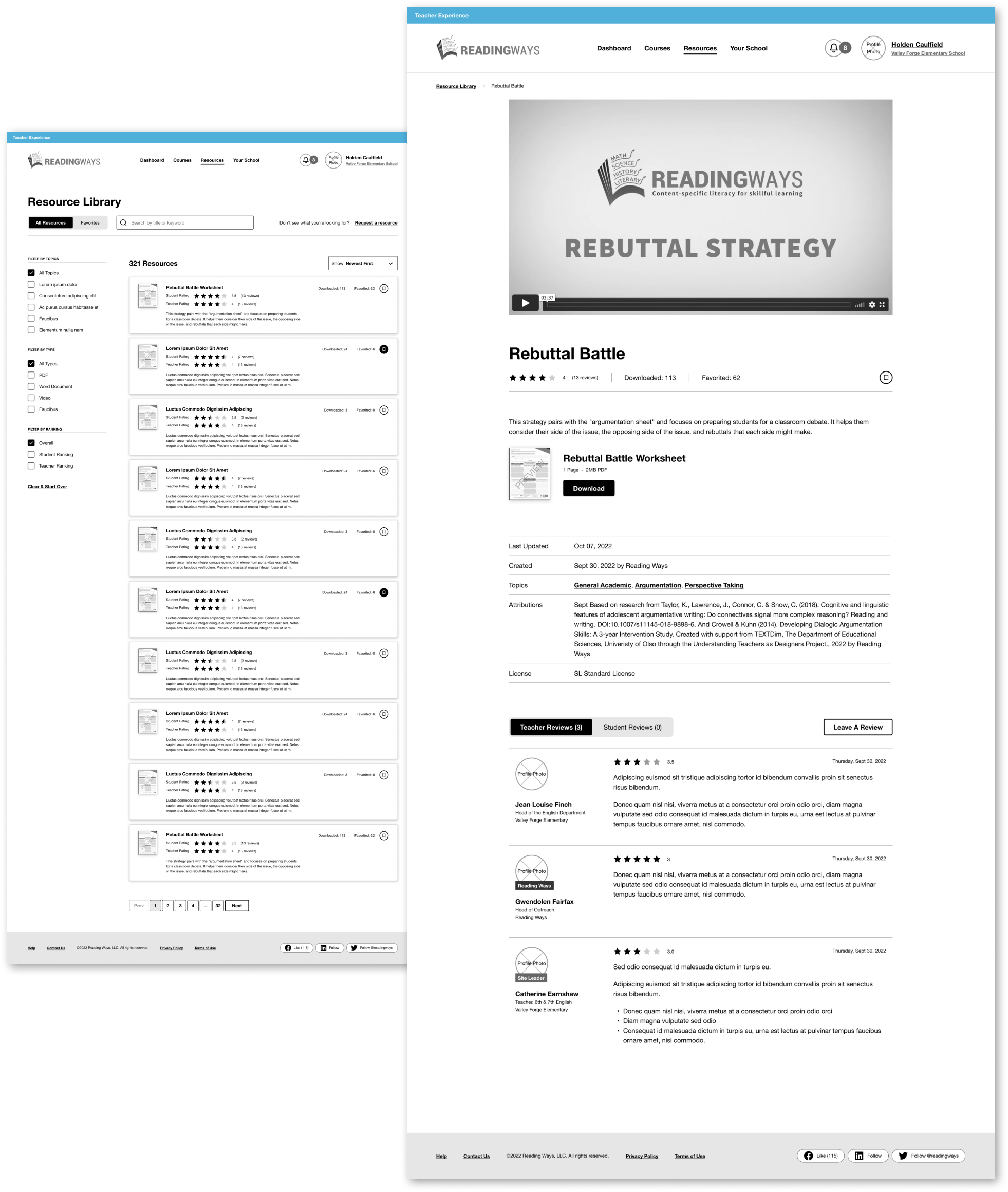
Filters, ratings, and reviews help pinpoint good learning tools.
Materials in the Resource Library are the “meat and potatoes” of the application. Weekly Activities usually centers around a Resource...like a worksheet, podcast, white paper, research doc, etc. While Courses deliver content and resources in a curated, linear fashion, the Resource Library is a space to browse and search resources in a more free-form way.
For example, if a teacher needs a good worksheet to help convey a core concept, that teacher can search, filter, sort, and find the perfect resource. Teachers can see ratings from other Teachers and ratings from students, download, bookmark and add feedback.
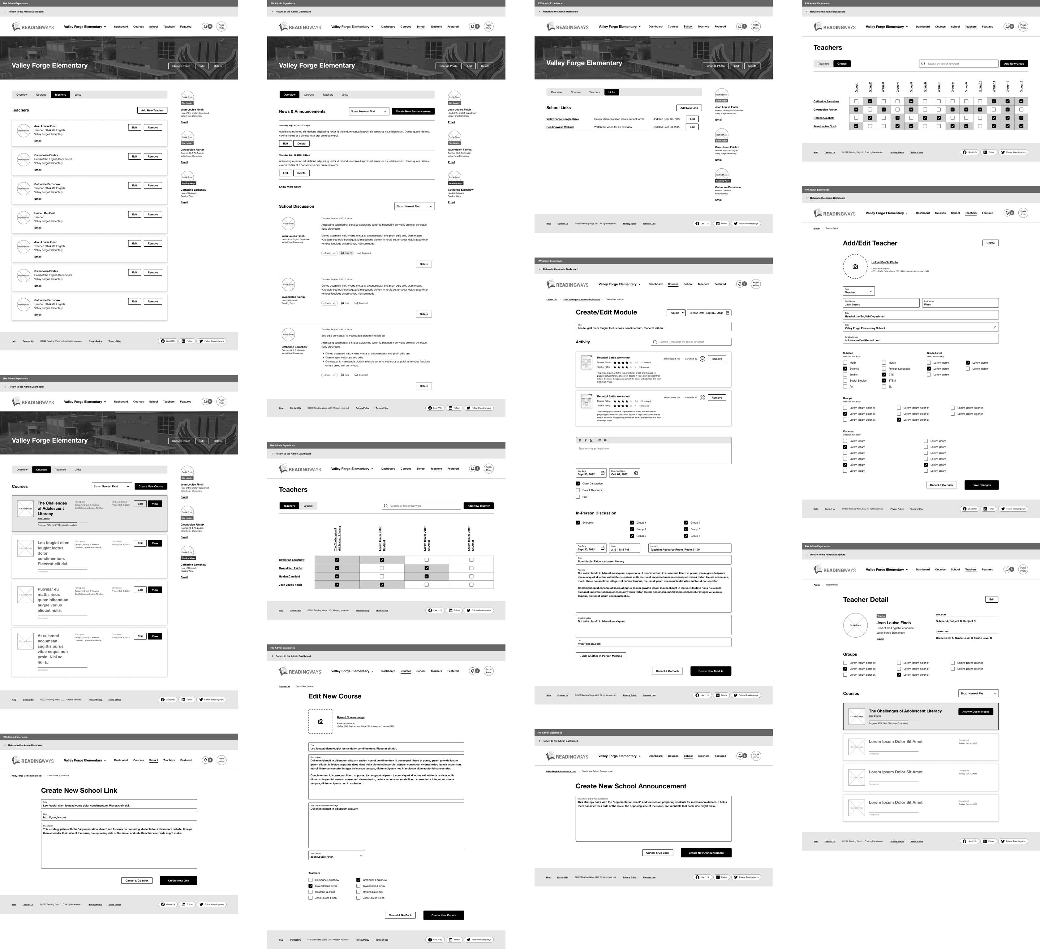
Branded school areas give school leaders lots of flexibility.
The application also included a dedicated and customiziable School section. Participating Teachers can share school-wide announcements, participate in discussions and more.
Wireframes shown below are from the School pages, and show the view that internal Reading Ways Administrators would see. This is also where Teachers and Courses are created and managed, as well as a slue of other properties.
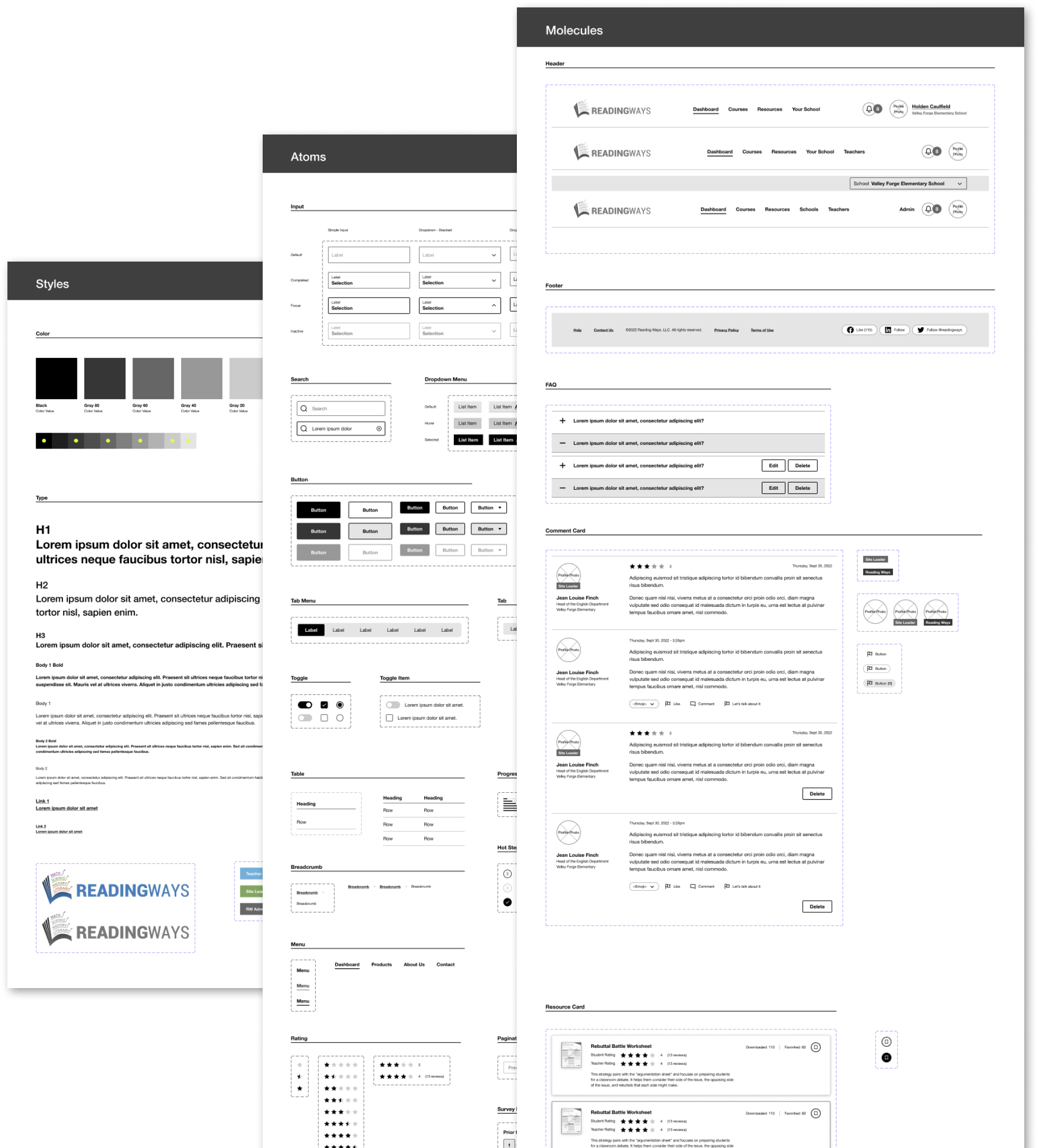
A custom UI Kit speeds up prototyping and design.
Because of the fluidity and iterative nature of the project, we wanted to create a simple UI kit that would allow us to move and revise changes quickly. Thinking in a modular way early in the process helped keep the number of elements down and also accelerated visual design - giving the UI designers prototypes and components to “skin.”
Let's talk.
Copyright 2023 Joshua Hathaway - Handmade in Austin, Texas - Eleventy, Sass, Nunjucks, HTML, and good ol vanilla Javascript


