

A food and sleep tracker that's easy, breezy
Johns Hopkins University - Research Study Mobile App
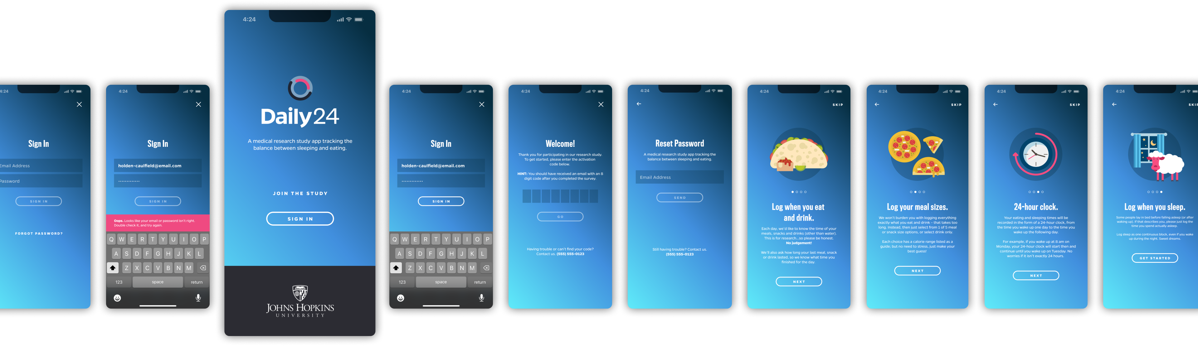
Daily24 is a companion app for a research project studying the balance of diet and sleep. Study volunteers record information each day, like how long they slept and what they ate.
Researchers at Johns Hopkins then analyze that data and find new insights on human diet. The lead researchers at the university started with a long wishlist of data they wanted to collect. It was way too much. The UX challenge was clear: design an app that collects the max amount of data with the least amount of user energy.
We led a series of workshops, collaborated with researchers, interviewed volunteers, and designed an app to make data collection fun. (Okay, not so much "fun," as much as "not boring.") Entering daily info is easy and quick. We also created incentives and gamification hooks too keep volunteers engaged. Light-touch nudges to encourage consistency. And we used a lot of empathy to guide the non-judgmental tone of the application.
Project Type / Agency
Native iOS Mobile App / The Gnar Company
Role
I helped sell the project, led discovery workshops and user interviews, collaborated with an internal product manager at JHU and engineering team at The Gnar, designed the app, and branded the study.
Design Activities
- User Research
- User Interviews
- Discovery Workshops
- Requirements Gathering
- Wireframe Prototypes
- Visual Design
- Brand Compliance
- Design System
- Brand Design
- Illustration
- Copywriting
Questions & Challenges
How do we capture hyper-accurate data and encourage entry consistency over a long span of time?
What imagery and tone of voice best resonates with our target audience?
How can we make boring data entry more enjoyable?
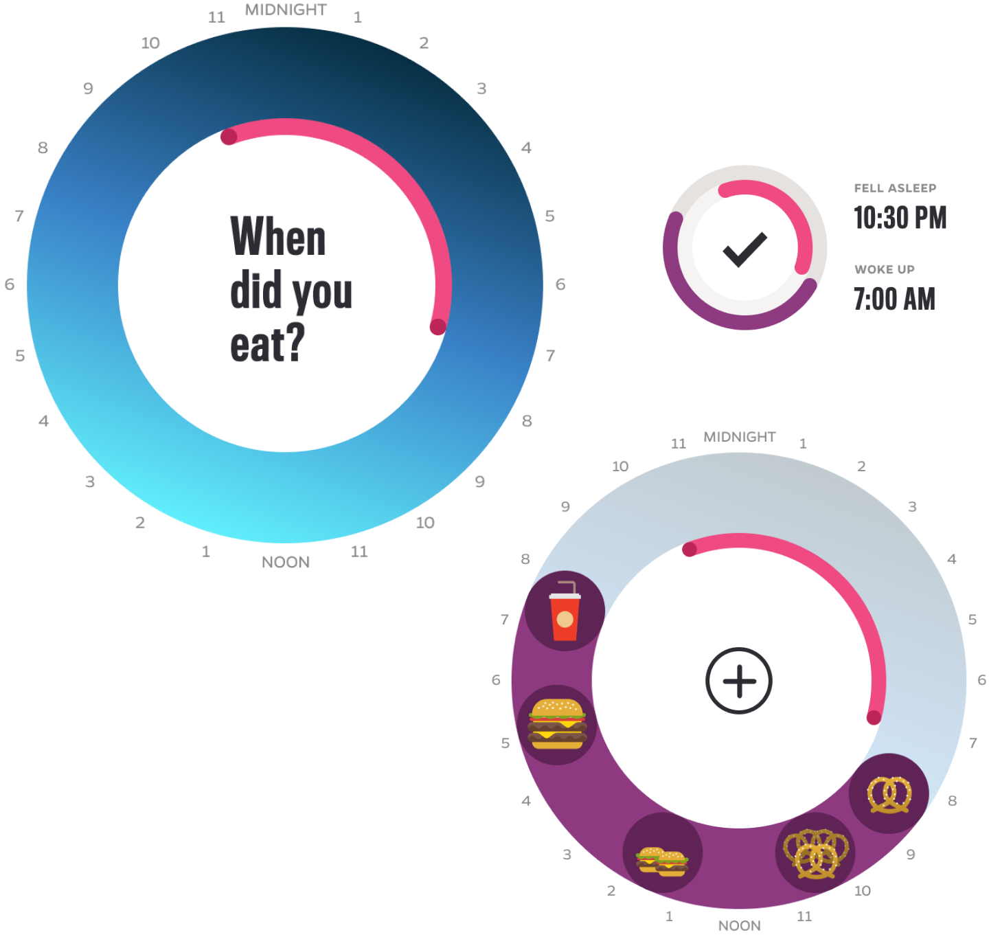
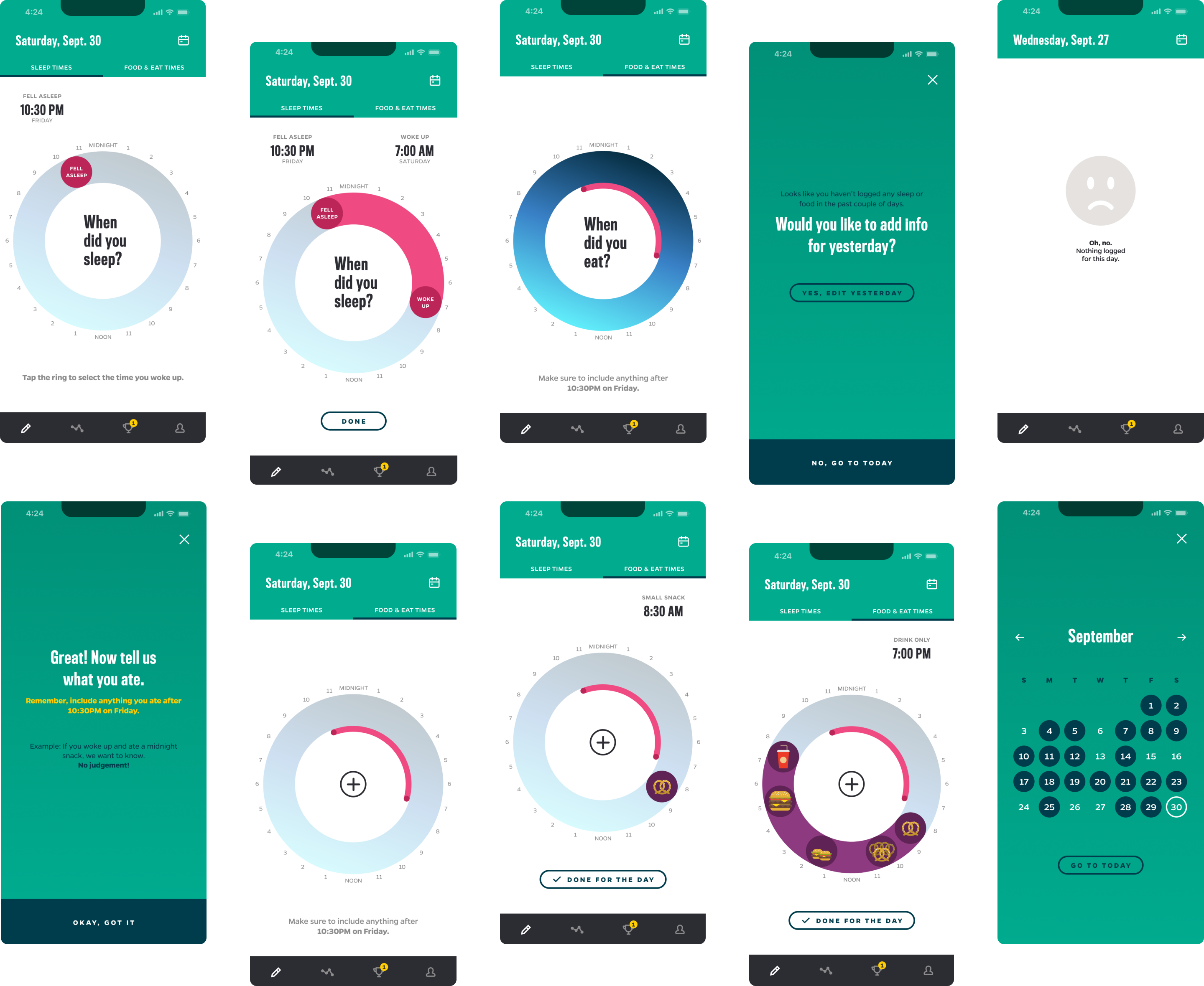
The time ring speeds up entry and provides context.
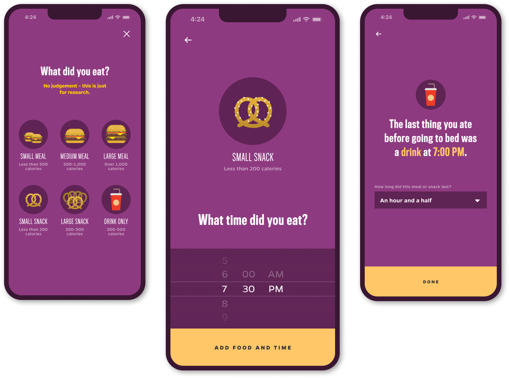
During user interviews, we learned that most folks had experience using diet apps. And the most unanimous feedback we received: counting calories takes a ton of time, and it's borrrrring.
We collaborated with Johns Hopkins researchers and reduced the amount of inputs. We then designed a workflow that asks the user a handful of questions each day. By only entering estimates and ranges, we increased accuracy and the likelihood of habit change.
Because context was important, we designed a visual concept called the “time ring.” Users can tap along the time ring to add a meal or snack and tap-drag to adjust as needed. We enlarged hit areas to make one-hand use easier. And used bold colors, icons, and typography to enhance accessibility.
By talking to users, we challenged some assumptions.
Early on, Johns Hopkins researchers wanted to mimic UX paradigms of existing diet/health apps. But when we spoke to volunteers, they actually wanted something different. Something way, way easier. Most folks didn't want to count calories or choose from thousands of options. And some even felt shame when they tracked their food. The experience we designed helps document information only - not influence behavior. We simplified the entry process, and designed a light workflow of screens. Instead of listing each calorie, volunteers choose between six meal/snack categories. The selections are big and bold, with bright food illustrations. Entry is fast and simple, which increases accuracy.
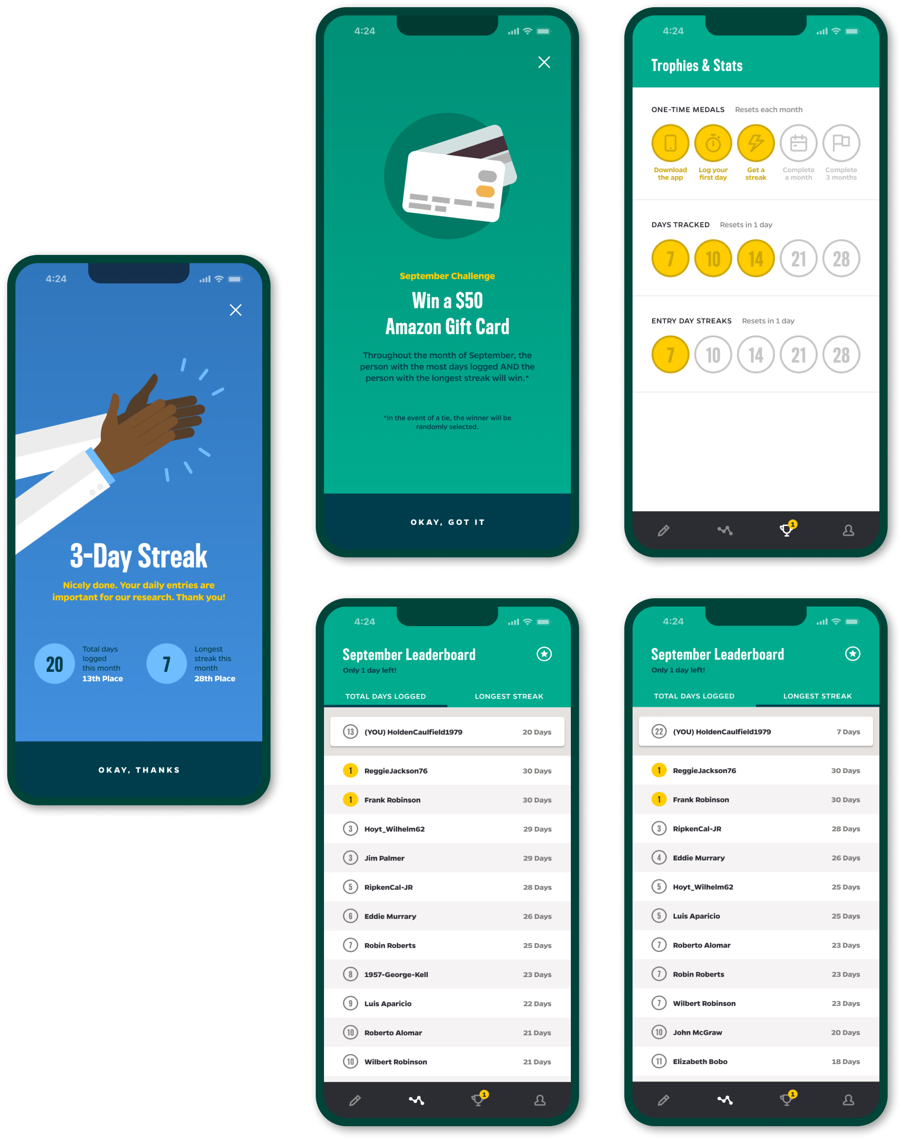
Gamification strategies keep folks coming back.
For the study to be a success, JHU researchers needed months of consistent, daily data. That's a lot to ask of volunteers. When we interviewed folks, we learned that a surprising amount played games on their phone each day.
We used gamification elements like stats, rankings, celebrations, and trophies to increase engagement. We designed monthly leaderboards for "Total Days Tracked" and "Longest Streak." Participants can track their stats and compare with others in the study. Each month, the top volunteers in both categories win gift cards. And users can earn medals by completing various achievements.
Vibrant illustrations keep things playful and judgement-free.
The illustrations in the app are bubbly and bold to embellish the playful tone. When we tested early designs, some volunteers didn't like the salads and healthier food icons we chose. The current design features more relevant/realistic for the target audience. This helps decrease shame and guilt, and keeps things light.
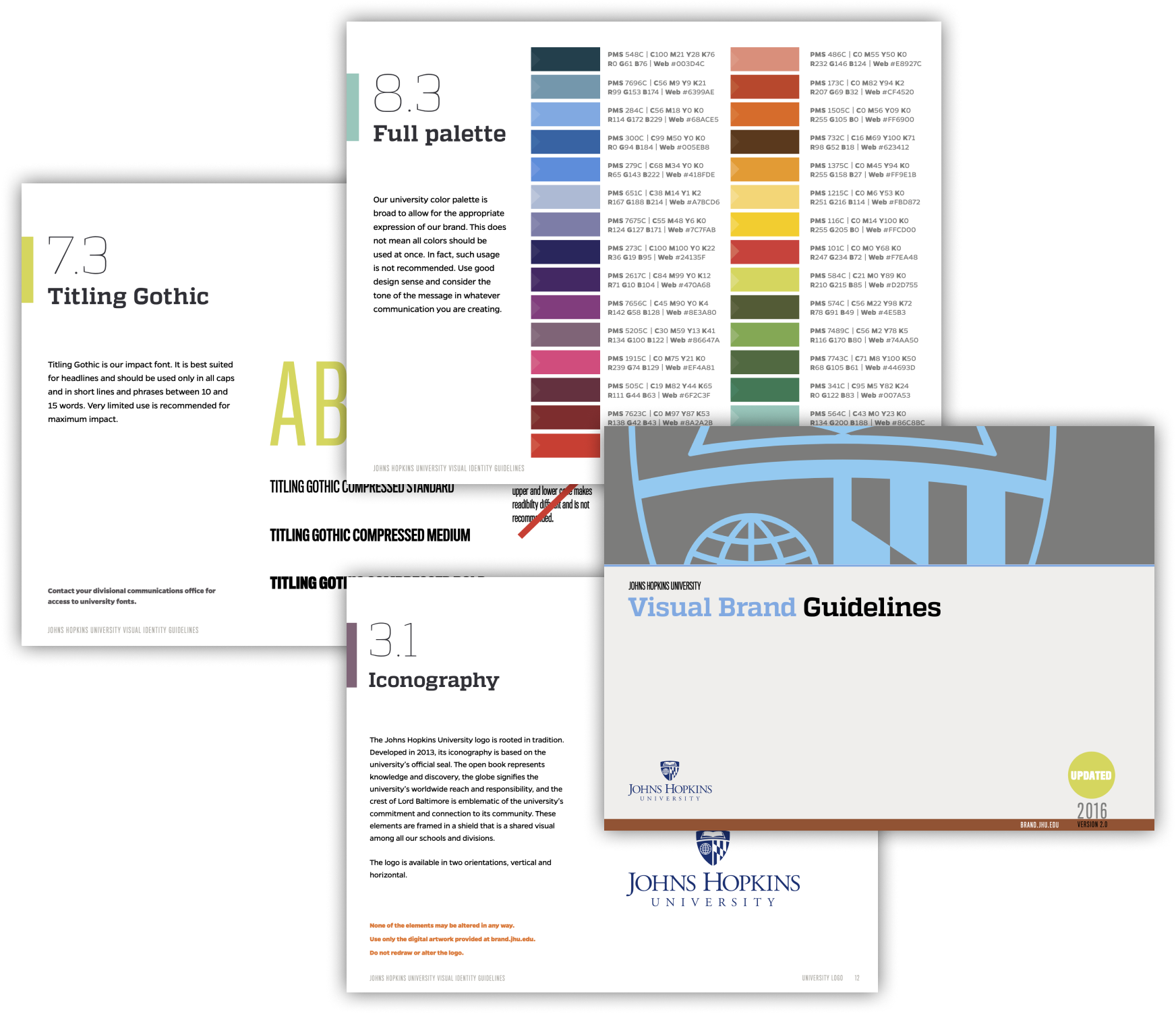
Complying with Brand avoided a speed bump.
Johns Hopkins University has a vast and thorough Brand Style Guide. Given the relationship of the study with the JHU brand, the app needed to followed the guidelines to the letter. We used their huge palette, typography, and imagery styles to craft a unique take on the Johns Hopkins brand.
The project quickly zipped through a notoriously long brand review process. This kept the app aligned with the brand, and helped us avoid a multi-week delay.
We created a study name and brand to match the app experience.
We named and branded the research study using an abstracted version of the time ring. The name and logo tied the mobile app (home screen icons, landing pages, etc.) together with other research study efforts. We worked with their marketing team to create a library of logo files, colors, templates, and more to help with other tactical aspects of the study.
Let's talk.
Copyright 2023 Joshua Hathaway - Handmade in Austin, Texas - Eleventy, Sass, Nunjucks, HTML, and good ol vanilla Javascript